• Skip to primary navigation
  • Skip to main content
  • Skip to primary sidebar
TheWayoftheWeb

TheWayoftheWeb

Content and Digital Marketing Specialists

  • Blog
  • The Cipher
  • About Us
    • Useful Resources For Businesses In Peterborough, UK
  • Contact Us
  • Show Search
Hide Search

Blog

Creating and Sharing Videos Online – Quick Guide

July 5, 2013 By Dan Thornton

The cost of creating videos has dropped dramatically in recent years, leading to an explosion in the footage being shot and uploaded across the web. From webcams and smartphones to RED cinematic cameras for motion pictures, the possibilities have never been more open. And the launch of Vine for videos via Twitter, and Instagram Video, means that short 6 or 15 second video clips have become viable tools for sharing ideas, content and marketing.

We’ve worked with talented video producers and helped with creating and sharing videos online for many years, and have achieved success with a number of brand channels. We also have plenty of experience in planning video production and distribution to get the most mileage from what can be expensive, and is often a time-consuming way to generate content.
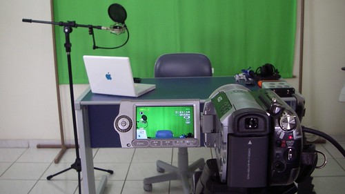
 

Video Set for Episode 02 (Camera)


Creating great videos:

The most important aspects of great video content are simple to prioritise:

  1. Great content
  2. Production and Editing
  3. Marketing and Distribution


1. Great Video Content:

The definition of great video content is not an epic Hollywood script and production. Sometimes huge audiences are simply the result of being in the right place at the right time, but often it’s the result of creating content which is interesting, informative, entertaining, shocking or funny.

The key is to have your objective at the front of your mind. If you’re looking to sell a service or product, your aims and content will be different to someone launching themselves as the next great comedian on Youtube.

With each video, you should have a clear aim – is it primarily to build awareness, encourage people to click to visit your site, or help them to better understand and use your product?

The legendary Charlie Bit My Finger grew into a business after becoming immensely popular, simply by being entertaining.

Keep the viewer in mind at all times. Unless there’s a dramatic reason, you want them to see and understand the reason for watching your videos as quickly as possible – if you need to include company branding etc, there are better ways to do it than a huge introduction clip, which is a slight fail for the famous ‘Will It Blend’ series – but the hook is enough in this case to suffer through it:

Do your research – check out what is popular and successful for your immediate competitors. How would you improve upon what already exists and offer something better?

Enthusiasm is vital. Who hasn’t watched a screencast or software tutorial delivered with all the flair of a tax audit?


2. Production and Editing:

While you don’t need high production values to achieve success, they’ll definitely improve your odds. Beyond an adequate camera or webcam, the two biggest problems with most videos are lighting and audio.

Audio can often be solved by investing in equipment such as a decent cabled lapel mic or a Bluetooth remote version for presenters. Or a decent microphone for recording to your computer for screencasts, webinars and more.

Meanwhile lighting can be solved by thinking carefully about location, and potentially using some cost-effective solutions to add some illumination to the subject.

Consider this example, in which audio is a key part (note the microphone in shot), the lighting is serviceable, but by combining shots together it achieves a great result without adding anything unnecessary:

When it comes to editing software, the choices range from free open source programs to professional video editing suites. But it’s not what you use, it’s how you use it:

  • Brevity and clarity is key
  • Make sure intros or overlays are as short as possible, and consider using clear, readable text to convey information to shorten the length of videos.
  • Use overlays to also cover links for more information.
  • Film in sections for longer videos, which allows you more editing freedom, and to change location etc to keep an audience interested.
  • Hide cuts with transitions such as full screen graphics, jump cuts etc, but don’t overdo it.
  • Editing will always take much longer than you first imagine, so leave plenty of time in your schedule.
  • Try to pay attention to the techniques being used in your favourite and the most popular, videos.


3. Digital Video Distribution:

Although Youtube is the most popular video channel on the web, there are several other locations which can also attract an audience. If you plan to cut and share content across these channels from the start, you can deliver far more mileage for your investment.

Video sharing sites:

  • Youtube
  • Dailymotion
  • Vimeo
  • Metacafe
  • Vine (6 second clips via Twitter)
  • Instragram Video (15 second clips)
  • Facebook

Uploading each individual to multiple locations can be time-consuming, but you can also utilise services such as OneLoad from TuebMogul, which lets you upload once and then automates delivery to multiple platforms.

For each site, ensure you have set up your channel with the correct avatar and profile images (We have a guide for social network images)

Think carefully about how you title your video. Ensure it is clear and contains the relevant keywords for search.

Optimise your description to build on the information in the video – include relevant links and supporting info which doesn’t need to clutter the video itself.

Add relevant keywords, including your brand name. By including your brand name as a keyword, it encourages video sites to include any other videos from your channel as related content.

Finally, make sure you’re sharing your own content across the various channels you have access to. Blog about it, and make sure you use it when it’s relevant to answer customer questions to lower your customer service time and costs, for example.


More video tips and advice to come:

As video has become an integral part of what we do for clients and our own sites, we’re planning a full series of more in-depth articles in the future, including more details guides to production, editing and more. To keep up with our content, feel free to follow us on your choice of social network or via RSS etc.

Make sure you upgrade to WordPress 3.5.2

June 24, 2013 By Dan Thornton

WordPress version 3.5.2 was released just before the weekend. We’ve already advised all clients to upgrade, along with making sure all of our own sites are running the latest version, as 3.5.2 is an important security release.

The new WordPress version fixes 7 security issues, and also contains some additional hardening measures, which is important given the recent spate of brute force attacks on a huge number of WordPress sites. The majority of attacks focus on basic defaults and outdated software, which is why it’s so important to stay current.

locks

Security Fixes in 3.5.2:

From WordPress.org:

  • Blocking server-side request forgery attacks, which could potentially enable an attacker to gain access to a site.
  • Disallow contributors from improperly publishing posts, reported by Konstantin Kovshenin, or reassigning the post’s authorship, reported by Luke Bryan.
  • An update to the SWFUpload external library to fix cross-site scripting vulnerabilities. Reported by mala and Szymon Gruszecki. (Developers: More on SWFUpload here.)
  • Prevention of a denial of service attack, affecting sites using password-protected posts.
  • An update to an external TinyMCE library to fix a cross-site scripting vulnerability. Reported by Wan Ikram.
  • Multiple fixes for cross-site scripting. Reported by Andrea Santese and Rodrigo.
  • Avoid disclosing a full file path when a upload fails. Reported by Jakub Galczyk.

As always, you should back up your site before any upgrade, and your update is likely to include changes to the database. If you’re struggling with WordPress, give us a shout and see if we can help!

New Facebook Open Graph tags for writers and publishers

June 21, 2013 By Dan Thornton

You may be familiar with the Author and Publisher tools which Google+ offer to websites, and now Facebook has added some additional tools for publishers, journalists and writers to boost their content on the social network.

The new Open Graph tags were officially revealed yesterday, and are as follows:

  • article:publisher lets a publisher link an article to their own Facebook page. When the article is shared in News Feed, a “like” button is displayed so people can like the publisher page.
  • article:author lets a publisher link an article to the Facebook profile of the author. When the article is shared in News Feed, a “follow” button is displayed so people can follow the author. The author needs to have Follow activated on his or her profile for this button to appear.

They are coded as follows:

<meta property="article:publisher" content="https://www.facebook.com/thewayoftheweb" />

<meta property="article:author" content="https://www.facebook.com/danthornton" />

This means ‘Follow’ and ‘Like’ buttons will appear for those who haven’t already followed the author or liked the Publisher page, when that content crops up in their newsfeed.

So well worth implementing to make the most of your visitors sharing your articles and content on social networks.

Post for admin purposes

June 11, 2013 By Dan Thornton

RY59NMSVSRN5

Top social networks: Guide to images for company pages

May 13, 2013 By Dan Thornton

Are you setting up social network profiles for your business? Or maintaining social media which already exists? Either way, it’s important to make sure your pages and profiles look their best.

If you’re updating your company logos, re-branding, or simply want to change images to give your page a refresh, then it’s important to ensure you know the right image dimensions, file sizes and positioning for each social network. So we’ve compiled the requirements in once place.

When looking at logo designs, always keep in mind that social media generally requires versions which will work in a rectangular landscape format (Cover images), and also a version which will work as a smaller, square image (Profile images).


Facebook  Pages Images:

TWOTWFacebookScreengrab
There are two images to maintain for a Facebook page.

  • Cover Photo: This should be 851 pixels wide x 315 tall. Smaller images must be at least 399 pixels wide and will be stretched to this larger size. Smaller file sizes will help quicker load times, and Facebook recommended a .jpg which is less than 100kb in size.
    They must include no more than 20% text.
  • Profile Picture: This should be at least 180 x 180 pixels square, which will then be displayed at 160 x 160 pixels. Leave space around your image or text to allow for cropping of the image.

Cover photo guidelines state that you should use a unique image to represent your page which can’t be ‘deceptive, misleading, infringe on anyone else’s copyright or be in violation of the Page Terms. You may not encourage people to upload your cover photo to their personal timelines.’

You should also account for your profile image being displayed on top of your cover photo, which is a 160×160 square starting 23 pixels from the left edge.


Twitter Profile Images:

TWOTWTwitterScreengrab
A Twitter page requires three images to be complete. Photo and Header Images are located under Account settings. Background images are changed under the Design setting.

  • Photo Image: The photo image appears throughout Twitter. It’s a 73 x 73 pixel square, with larger files able to be uploaded. File size can be up to 2MB in JPG, GIF or PNG formats.
  • Header Image: This appears behind your profile information on your Twitter page. It’s recommended to be 1252 wide x 626 high, and with a maximum file size of 5MB.
  • Background Image: The background image can be up to 2MB in size, with no fixed dimensions as you can choose to Tile your image if desired, although we wouldn’t recommend it! In general, a 1600×1200 .JPG image will be the right dimensions for your Twitter background.

When designing a Background Image, remember that the navigation menus on a Twitter profile will take up significant space beside the Twitter feed. Limit graphics to under 200 pixels from the left-hand edge to ensure they can be seen clearly.


Google+ Page Images:

TWOTWGoogle+Screengrab
Two images are needed for the Google+ page for your company:

  • Profile Picture: These have recently been changed to display as a circular profile image, meaning that your 250 x 250 square dimensions now need to account for circular cropping with plenty of space around the focal point of your image.
  • Cover Photo: Cover photos are now displayed in a 16:9 ratio, with a size of 2120 wide x 1192 high to display properly.


Youtube Channel image sizes:

TWOTWYoutubeScreengrab
As another Google property, the new ‘One Channel’ designs for Youtube are similar in some ways to Google+. Again, there are two images required:

  • Profile Picture: Currently still a square image, so we use a 240 x 240 square which then displays at smaller sizes.
  • Channel Art: A single 2560 x 1440 pixel image which can be optimised to display properly on different devices with a safe 1546×423 central area which works across platforms, a wide area for tablets, larger desktop displays, and the full image on TVs. A template is available to download from Youtube’s help page.

Notice that on your page, the Profile Picture will sit in the top left of your Channel Art.


LinkedIn Company Page Images:

TWOTWLinkedInScreengrab

LinkedIn requires 3 images for a company page.

  • Image: 2MB PNG, JPG or GIF, which must be 646×220 pixels or larger.
  • Standard Logo: Max 2MB PNG, JPG or GIF which will be re-sized to 100×60 pixels.
  • Square Logo: Max 2MB PNG, JPG or GIF which will be re-sized to 50×50 pixels.

Don’t forget to click Publish after adding your Image, or it won’t be saved.


Flickr Profile Image Requirements:

FlickrCoverImage

Photo sharing site Flickr has unveiled a new design effective from May 21, 2013, which now includes a Cover Photo on the profile page for every user.

The selection of photos for both Cover Photos and Avatars are both limited to either new uploads or Recent Photos.

  • Cover Photo: There’s no official size guidelines, but looking at how the page displays above, the Cover Photos is approximately 1349 pixels wide by 235 pixels high. The Flickr navigation menu stretches 45 pixels down across the top of the image, with the username, avatar image, and other information stretching up 120 pixels from the bottom.
  • Profile Photo: 300 x 300 pixels square


General profile tips:

There are numerous other social networks which we could have also included, ranging from Pinterest and Instagram to Reddit and Stumbleupon. Most simply require a square profile image, but let us know if you’d like to see any additions to our list above.

We’ll keep this page updated with the latest changes, so it might be worth bookmarking us, or following us on one of the above social networking sites to make sure you’re up with the latest designs.

  • « Go to Previous Page
  • Page 1
  • Interim pages omitted …
  • Page 5
  • Page 6
  • Page 7
  • Page 8
  • Page 9
  • Interim pages omitted …
  • Page 224
  • Go to Next Page »

Primary Sidebar

Join us…

  • Facebook
  • Instagram
  • LinkedIn
  • RSS
  • Twitter

We only exist to deliver results for your business. So you get fresh Content, expert SEO, engaging Social Media, or a new Website which is right for you – and your customers.

We help you build your brand, reach more customers and increase your revenue

Search

Categories

Creative Commons License
This work by TheWayoftheWeb is provided under a Creative Commons Attribution-NonCommercial-ShareAlike 4.0 International License.

Start growing your business today Contact Us

TheWayoftheWeb

Copyright © 2026· TheWayoftheWeb Ltd. Company Number 08038527. ICO registration: ZB397650